|
Shopping eBay With a Mobile Device
If you do not own or have had the opportunity to sit down with a smart phone or tablet and visit eBay then you would be rightfully concerned about how your item description templates will appear on such devices. You might imagine that much of the item description would slide off the right edge of the small screens making it cumbersome to view.
That isn't at all what actually occurs. eBay detects the use of a mobile device and transfers the visit to a version of their site designed for viewing using such devices (m.ebay.com). A shopper may use an "eBay App" with the same result: Item listings are displayed differently with the seller's item description assigned to a full screen view.
Within that screen the entire width of the item description fits but will be, of course, smaller than on a computer screen. Below are screen shots taken directly off eBay with a Galaxy S4 smart phone. The phone has a screen about 2-1/2 inches wide by 4-1/4 inches tall. The template when viewed on a computer screen is 820 pixels wide and would not reduce further than that (nor would we want it to).
The views below are set to 240 pixels wide to provide reasonable similarity to the size displayed on the smart phone. Bear in mind it is much more likely shoppers will be using a tablet (such as an iPad) which have screens at least 3 times bigger plus these shots are not quite as clear as when actually viewing the smart phone screen. Thus these represent a worst case scenario:
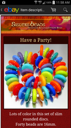
Screen Shot 1
The top of the item description. Nothing other than the item description appears on the screen.
|
|
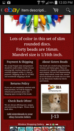
Screen Shot 2
The middle of the item description. On the actual Galaxy S4 Smart Phone screen the smaller text is clearer and readable.
|
|
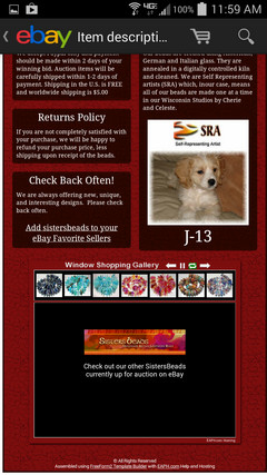
Screen Shot 3
The bottom of the item description. Scrolling down through an item description is super easy and quick with a flick of a finger on the screen. More of the template will display to begin with than on a computer so length (tallness) is not an issue.
|
|
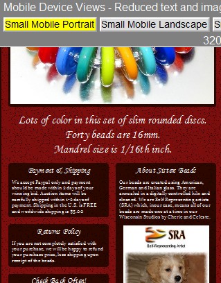
Screen Shot 4
Zooming for a closer look is simple. Just double tap on a section of the screen and that section expands correctly to the width of the screen. Double tapping again zooms back out. Here "About Sisters Beads" was double tapped. All mobile devices also provide for spreading and pinching using our fingers to zoom in and out.
|

|
|
Fine Tuning Using FreeForm2
As described to the left, mobile devices themselves and eBay have already done most of the work producing a view of an item description template that looks just about as good on a small screen as on a computer screen. All that remains is some fine tuning and FreeForm2 provides all the tools needed:
Text Size
Text size in relation to the overall width of the layout is your most important concern. If you are displaying text across the entire width of the layout then set it to display quite large. The example layout to the left has the "Lots of color in this set of slim rounded discs..." text size set to 270%. That keeps it easily readable without needing to zoom in. To keep all text at least barely readable without zooming set a font size of at least 110%.
FreeForm2's "Text Fonts Panel" provides for easy visual adjustment of font sizes throughout the template. See Feature Highlights
Layout Arrangement
Use a two column layout for placement of Text Boxes. Doing so takes advantage of the built in double tap zoom capability present on mobile devices. Screen Shot 4 to the left demonstrates how double tapping the content of a column zooms it in perfectly to fill the screen. Zooming in on text that extends across the entire width of the layout would not zoom in such a way.
FreeForm2's "Shell Layout Editor" provides for easily moving sections into single or two column arrangements. See Feature Highlights
Text Fonts
Text Fonts may appear differently on mobile devices and even on other computers. In the FreeForm2's Design Menu "Text Fonts" panel a variety of font families are available to choose from. Six of them are identified as "Safe Text" and all the rest as "Unsafe".
Avoid using the Unsafe for anything but Title, Picture Section Text, and Section Headings. For example, in the screen shots to the left the "Unsafe Cursive 02" font family was used for the "Lots of color in this set of slim rounded discs..." and for the section headings but on the S4 those are displaying something close to Times New Roman and larger than the intended font.
Use only the "Safe Text" choices for Text Boxes which will more likely result in it appearing the same size on all devices.
FreeForm2's "Text Fonts Panel" provides for easy visual adjustment of fonts throughout the template. See Feature Highlights
Use FreeForm2's "eBay View"
FreeForm2 includes a preview tool that displays simulations ranging from the smallest smart phone to the largest tablet. The simulations shrink to fit just like when using a mobile device on eBay.
Use the tool to fine tune text size and layout to produce a great looking overall presentation in all screen sizes.
FreeForm2 eBay View
This screen shot displays the smallest simulation and demonstrates the smaller font size on a computer vs. the Galaxy S4 phone as discussed above.
|
|
|  FreeForm2 © 2011-2014
 Launch FreeForm